We were happy to receive an email today from our friend, Helen Risom Belluschi, telling us that her father, the prolific, preeminent furniture designer Jens Risom, is featured in Dwell Magazine's September issue.
We were even happier to reach into the mailbox this afternoon to find our own copy of the magazine and to get our first look at this terrific looking chair Jens designed as part of a new collection scheduled to be released this fall for Ralph Pucci.
We last wrote about Jens in this birthday salute. At 93 years old he is still busy creating designs for furniture that are as inspiring as those he made 60 years ago. Go Jens!! – GF
(Does this chair – which makes me think of a very updated wing chair – actually have 3 legs? Very cool!)
Friday, July 31, 2009
Thursday, July 30, 2009
Adorable Garden Stools
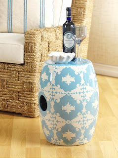
Ceramic garden stools are everywhere nowadays. We think the trend started with the boutique hotel chains like Mondrian, where they were using white garden stools everywhere. More often seen indoor as decorative items, they are actually meant to be used outdoor. Super easy to clean and versatile, decorative garden stools can be used as seating, side tables, or just for decoration.
We thought instead of the typical white ceramic garden stools, we show you some other ones that are more colorful and interesting.
These range between $200-$250 each. All are from Emissary USA and can be found on our garden stool section.
We thought instead of the typical white ceramic garden stools, we show you some other ones that are more colorful and interesting.
These range between $200-$250 each. All are from Emissary USA and can be found on our garden stool section.
Wednesday, July 29, 2009
Pretty Rugs from Surya
We have a soft spot for dainty & pretty looking things. Like things with soft, muted colors; subdued patterns, delicate designs.
It's the reason why we really like this rug collection from Surya. It's full of all the things stated above.
Here are some of our favorites:
The rugs are really inexpensive. They run about $400 (for a 4 x6) to $1100 (for a 8 x 10). They are machine-made with wool/vicose. Purchasing information can be found on our modern rugs section. If you like to see more of Surya's products (they also make fantastic pillows and throws), visit their web site.
Modern Silk Flowers from NDI
Silk flowers have a bad rep, don't they? They are perceived as chinzy and cheap, but truly, they do not have to be. The quality of silk flowers has improved tremendously over the last few years. Now you can find very nice, high quality arrangements that look almost as good as the real ones.
We think the key to pick silk flowers is to find arrangements that are as simple as possible. The simpler they are the more realistic they look. Mixing them with fresh flowers or branches is an effective way of displaying them. Finally, buy the best quality that you can find. Cheap silk flowers are like cheap shoes--you can spot them miles away.
NDI just came out with a new catalog and we thought some of the arrangements are quite nice. Here are some that we like:
You can see the rest of the catalog at NDI. Purchasing and pricing information can be found in our silk flowers section.
Monday, July 27, 2009
Hey – You're Stepping on my Nose!
The rug tile company, Flor, is producing rugs using some of the witty images made over the years by Swiss-born graphic designer / photographer François Robert. Robert has produced a couple of books of images of human-made objects that have discernable "faces" (Face to Face, which sold out in Europe and the U.S. and Faces published by Chronicle Books).
I see faces in all kinds of things, and I've know Robert's work in this vein for years, so I really get a kick out of this application. –GF
Saturday, July 25, 2009
Our new decorating blog launched today!
We are pleased to announce the launch of our new decorating blog , Digging Decor.
Our new blog will cover interior design much more extensively, including design products, design ideas and design news. Think of it as a huge addition to this web site, which will still be updated regularly by our staff.
We'll hope you'll come visit soon. It's a great looking site, we're very proud of it!
Wednesday, July 22, 2009
too big to take to the beach
This post is not about a house, or hardware, or a great architect, although its 1066 pages certainly include something about each of those.
It's hard to imagine that any subject has been passed over in Alan Fletcher's amazing book, The Art of Looking Sideways. Although it was published some years back – and, sadly, Alan died way too early at 74 years old, in 2006 – I am just getting around to reading it now.
In a filmed interview, Alan says the book is "for visually curious people" – not for those who are funny-looking, but for those who see past the obvious and delight in the connections they make there. It is deeply fascinating, and, although I know it's a bit of a cop-out, I'm going to excerpt directly from the publisher's (Phaidon) website which describes it well.
The Art of Looking Sideways is a primer in visual intelligence, an exploration of the workings of the eye, the hand, the brain and the imagination. It is an inexhaustible mine of anecdotes, quotations, images, curious facts and useless information, oddities, serious science, jokes and memories, all concerned with the interplay between the verbal and the visual, and the limitless resources of the human mind. Loosely arranged in 72 chapters, all this material is presented in a wonderfully inventive series of pages that are themselves masterly demonstrations of the expressive use of type, space, colour and imagery. This book does not set out to teach lessons, but it is full of wisdom and insight collected from all over the world. Describing himself as a visual jackdaw, master designer Alan Fletcher has distilled a lifetime of experience and reflection into a brilliantly witty and inimitable exploration of such subjects as perception, colour, pattern, proportion, paradox, illusion, language, alphabets, words, letters, ideas, creativity, culture, style, aesthetics and value. The Art of Looking Sideways is the ultimate guide to visual awareness, a magical compilation that will entertain and inspire all those who enjoy the interplay between word and image, and who relish the odd and the unexpected.
I noticed that the book is paginated by spread – that is, each page and the one facing it is designed and counted as a unit (which is how we graphic designers lay out books, magazines, and things that open up – creating facing pages that work together in a dynamic way to support the story being told). That one subtle consideration (the folios are, like, 4 point type printed in grey...) is huge to me: each spread is an idea to be absorbed altogether, independent of what precedes or follows, not read one page at a time. Like looking at an exhibition where each piece has its own power, but assembled with others makes an even greater statement.
I feel I could / should read this book now, and keep reading it forever. I knew Alan, and when I see his line drawings and his own unmistakable handwriting here – as 'real' to me as any foundry's typeface – I miss him and am grateful for the proximity to his brilliance that I enjoyed even briefly. – GF
Better hope it's a BIG check in the mail
Well designed window and door hardware, mailboxes – everyday items that execute their purpose with elegance and perfect functionality delight me, perhaps to a slightly excessive degree. . . This handsome mailbox caught my eye in the daily sale email I get from Design Within Reach.
A wall-mounted mail box: original price – $900, on sale for $450. What is with DWR? Great looking stuff, much of it, but I resent them billing themselves as affordable or within reach of anyone but wealthy design snobs.
I've always observed that every house in (yeah, you-know-where) Switzerland has either a cluster or single mailbox that is sophisticated and low profile, and virtually impossible to vandalize with a baseball bat (not that I've tried. honest.). Residents, I'm pretty sure, are NOT spending $900 OR $450 on their briefkasten! – GF
from top: DWR Line One mailbox, Blomus Signo letterbox, typical bank of Swiss briefkasten, antique built-in mailbox in Switzerland, terrific-looking stand-alone letterbox, our kids and mailboxes in front of the apartment we rent, typical rural or suburban American "expressionist" mail boxes
Monday, July 20, 2009
Chichester Road and Modern New Canaan
I've been taking detours down Chichester Road in New Canaan for almost two decades, just for the fun of it, the way you might stop into a museum every so often to see paintings you love. There are five modern houses on Chichester, and while I can't say they are the most beautiful modern houses in New Canaan, I'm absolutely sure there is no cluster of modern houses in New Canaan that are both so beautiful and so easy to see from the road.
It is because the houses are so visible and so beautiful, and because of the way they were developed, that I think Chichester stands as the epitome and symbol of Modern New Canaan, more so than the houses of the Harvard Five. The Harvard Five houses are terrific, but they are widely scattered and generally hard to see, and so they exist mainly for their owners, for participants in modern house tours and for readers of the large format books that the Harvard Five -- demi-gods that they are -- seem to inspire.
None of the houses on Chichester were designed by Harvard Five architects. On the contrary, the modern house neighborhood on Chichester is the work of two men -- John Black Lee and Hugh Smallen.
Lee and Smallen bought the land and they planned it as a subdivision of modern houses -- in fact, they required that the houses be modern. And then they designed four of the houses (a fifth, which was not part of the original subdivision, was designed by William Pedersen).
So when I think of Chichester's history, visibility and beauty -- its prominence in New Canaan -- I'm compelled to say that Lee and Smallen are seriously undervalued as important figures in New Canaan modernism. They've been overwhelmed by the adoration of the Harvard Five, which has left other good modern architects in New Canaan unjustifiably overshadowed, Lee and Smallen prominent among them.
Gina and I have always thought the house John Black Lee designed on Chichester (known as Lee House 2) to be probably the most beautiful house we've been in (the picture above, which I borrowed from the Modern House Survey, is of Lee 2). My one visit was on a humid day several summers ago, when I noticed a newspaper ad for a realtor's open house at one of the other houses on Chichester; it turned out to be Smallen's Becker House and as we drove to it along Chichester we noticed that there was an open house that day at Lee 2 as well, so we got to see both. Smallen's house was beautiful, Lee's both exquisiite and, it seemed from the short time we were in it, extremely livable. Here's what the Modern House Survey says about it:
Lee House 2 was designed by John Black Lee for his family after they had outgrown their first house on Laurel Road. Lee acquired the lot in 1955 ... and the house was completed in 1956. This lot was part of the twenty acres on Chichester Road that Lee and Hugh Smallen had purchased in 1954 to be subdivided into six parcels with the provision that the new houses built on the lots were of Modern design.
The other houses on Chichester are the Parsons House (with a garage designed by Lee) and the Smallen House, both designed by Hugh Smallen, and William Pedersen's Beaven Mills House. Take a slow drive down Chichester to check them out or, better yet, park and walk. It's a beautiful road and the history and context provided by the modern house survey makes it all the more interesting and reveals its significance. -- ta
Sunday, July 19, 2009
White Decor-So Refreshing
Did you see the latest issue of Elle Decor? It features the home of Monelle Totah, vice president of design for Williams Sonoma. We thought it's worth a feature post because it's such a refreshing style that is so achievable. By that, we mean you can find everything in the home quite easily. Not like those features where the owners alway tell us they brought home these chandeliers from some Paris fleamarket on their backs, you know? For some reasons a Paris fleamarket always sounds more glamorous. What's wrong with a flea market in, say, San Jose?
Anyway, you can find most of the items in the feature (from Williams Sonoma, of course, but other sources as well).
Here is a picture of it:
To see the rest, click here...
Anyway, you can find most of the items in the feature (from Williams Sonoma, of course, but other sources as well).
Here is a picture of it:
To see the rest, click here...
The Five Most Tiresome Decorating Trends
You know how when you get too much of something, it becomes tiresome really fast?
Take reality TV for example, how many permutations of it can we take? Does anyone care about Jon and Kate, or the Real Housewives of whatever?
Sidenote: Eventhough this has nothing to do with home decor, here is an interesting article from the NY Times about reality TV.
Home decorating is kinda like that too. Once a trend is caught on it spreads like a virus and next thing you know, everyone is doing it.
Which leads us to the most tiresome decorating trends ever (in our humble opinion)...
Here they are:
1) The Faux Tuscany look. We see this in almost 50% of the household we go to. Usually they are McMansions. The kind that you see in Real Housewives of Atlanta or Orange County, for example. Lots of faux-finished walls, heavy Tuscany-inspired brown wood furniture, lots of fringe, lots of big rooms no one ever uses, lots of heavy drapes in jewel tones, lots of pillows on the bed, lots of granite counter. It's so dated!
2) The faux Hollywood Regency look-this trend was started by Kelly Wearstler & Jonathan Adler a few years back and now it's everywhere. Once you see it in Z-Gallerie, you know it's time to NOT get into it. This looks consists of a lot of fake white lacquer, lots of bright colors, lots of funky patterns. It could be fun (but only for a minute and a half).
3) The W-Hotel look-do you know this look? All the furniture looks like it's from the W-Hotel, and if you've been to one W-Hotel you've been in all of them. They are all brown and white and straight-edged and black and white and boring.
4) The faux-loft look-everybody is building "lofts" nowadays. But instead of authentic lofts that were converted from old buildings, the new lofts are cheap condos built without walls. It usually goes with the mandatory minimalist furniture that looks absolutely cold and uncomfortable.
5) The faux-Asian look. We were at this gorgeous, 7-million dollar home the other day and we swear, there was a Budha in every room. What is up with the Budha? One or two is okay, but lots of it, combined with everything Asian is an overkill. Like lots of red color, lots of bamboo, lots of elephants and horses! It just looks kitschy...
What do you think? What trend do you think is tiresome?
Friday, July 17, 2009
Julius Shulman
Julius Shulman, photographer of modern architecture (California houses -- Neutra, Eames -- in particular), died Wednesday. He was 98! Here's his Times obit.
His ost recognizable image may be of Case Study House 22, which you can see here. (This appears to be death week on Modern House Notes.) - ta
Tuesday, July 14, 2009
Thank you, Edward Durell Stone, Jr. 1932 – 2009
Edward Durell Stone, Jr., son of modernist architect Edward Durell Stone, Sr., has died at the age of 76 in Florida.
Born in Norwalk, CT, Stone received his bachelor's degree in architecture from Yale and his master's in landscape architecture from Harvard. In 1960 he founded Edward D. Stone, Jr. and Associates in Fort Lauderdale, FL, which became one of the preeminent planning and landscape architecture firms in the world, receiving over 140 statewide, national and international awards. 3 different U.S. presidents appointed him to the Presidential Commission of Fine Arts. He seemed to focus on tourism and community-living projects in Florida, but had some pretty far-ranging projects as well, like helping design a panda preserve in China, working on high-end resorts in France, and other projects in the Caribbean and Europe.
But, being from Westchester County, NY, and having gone to SUNY Purchase for art school, I was most interested to learn that it was he who designed the sculpture gardens at PepsiCo's headquarters in Purchase, NY, over 30 years ago. Of course, his famous father designed the corporate headquarters itself.
Read what the NY Times wrote about the Donald M. Kendall sculpture gardens, and try to squeeze in a visit if you are ever in the area. We live only 35 minutes away, and I think I've only been there once! No excuse for that, as it is a really wonderful place – and free! – GF
Sunday, July 12, 2009
Los Angeles Taste Makers
The Los Angeles Time Magazine today has an excellent feature on the up-and-coming taste makers in Los Angeles, primarily in the field of fashion, interior design, architecture, arts and entertainment.
We find it so inspiring...It's so nice to read about people who are so incredibly creative. It's also nice to discover people & names we never heard of.
Featured here is Sally McQuillan:
"She doesn’t like to drop names—McQuillan prefers to let her résumé do the talking. But ask any number of decorating heavyweights, and they’ll tell you the fiercely inventive fabric designer, known for setting trends in color and pattern, is a home-furnishings sensation."-LA Times Magazine
Read on...
Smith & Hawken Closing All Stores
One of our favorite garden stores, Smith + Hawken, announced that it will close all of its 56 stores by the end of the year.
Another victim of this horrible economy....
Sales starts this week at all stores. The online store has been shut down.
Another victim of this horrible economy....
Sales starts this week at all stores. The online store has been shut down.
Friday, July 10, 2009
Very Modern Lighting from Nuevo
We just saw some very cool lighting fixtures from Nuevo that we thought you might want to check out. This is a Canadian-based company and they make amazing barstools, modern furniture and lighting. We like their lighting collection quite a bit. It's are not too expensive and they are very unique. If you have a modern theme for your home decor, it'll be a great fit.
Here are some samples:
Now, because these are not too expensive they are not made of Murano glass or crystal or anything like that. They are made of acrylic, actually. They do look pretty cool though, and if you are in the mood for something fun but you don't want to spend a lot of money, it might be a good choice.
http://www.nuevoliving.com/ (this is a trade site only and you'll need a password to get in).
Fresh & Clean- White Home Accessories from Zodax
We just got back from Mexico lately and for some reasons, we are just so into white! Maybe it was because it was so hot in Tulum, the only appropriate thing to wear is white linen. And the only thing that looks good in a home is white furniture and white accessories.
So we were thrilled when we saw these home accessories from Zodax at the LA Home Show this week. This is a small home accessories company based in the LA area. They have very cute stuff!
Here are some samples:
This lamp is adorable, don't you think?
We like this side table for setting down a drink or a book...
So we were thrilled when we saw these home accessories from Zodax at the LA Home Show this week. This is a small home accessories company based in the LA area. They have very cute stuff!
Here are some samples:
This stool is adorable. It comes in blue/white and yellow/white...
This set of box is perfect for storing jewelry...
This lamp is adorable, don't you think?
We like this side table for setting down a drink or a book...
Subscribe to:
Posts (Atom)