Wednesday, May 27, 2009
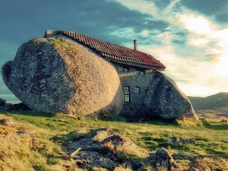
Les maisons les plus insolites
My Swiss friend, the musician and graphic/web designer Nico Monguzzi, posted this link to some pretty odd buildings from around the world. – GF
The house itself was a movie star
Again, thanks to Grain Edit for alerting us to this tidbit: the MCM house featured in the movie Ferris Bueller's Day Off – The Ben Rose home designed by A. James Speyer and David Haid – is for sale. – GF
Tuesday, May 26, 2009
Mid-century Modern summer fun via Grain Edit
Some fun from a booklet of Mid Century Modern vacation and leisure home plans. Seen on the wonderful site, grain edit. – GF
Monday, May 18, 2009
10 Things You Must Have in The House
We love lists, don't you? We love reading other's people list too, mainly because we're lazy and sometimes it's nice to have other people to do the work so we don't have to think so hard.
We recently saw a list of 100 things you should do in LA before you die by Caroline on Crack and we thought it was great. For those who live in LA, it's a really fun blog to read. For those who live outside LA, it's a great resource to find things to do in LA if you visit.
So we thought we come up with our own list. Since this blog is about the home, we'll focus on that theme. And since 100 is way too many for our brains, here is a list of 10 things you should have in the house:
1) A fantastic bed. This is where you spend of your time and this is where you should splurge and buy the best possible mattress you can find. Hotel mattress are the best! We like the ones from Westin. They even teach you how to make up the bed at home.
2) Fantastic bed sheets. They don't have to be expensive. We find amazing ones at Nordstrom Racks that have very high thread count and get softer after each wash.
3) Fresh scented candles, and please, none of that Glade cheap stuff. Scented candles are like perfume, the cheap ones just give you a headache. We love Votivo and Dyptique.
4) Amazing wine. Even if you don't drink wine, have some anyway. Your guests would appreciate it.
5) A great sofa. This is another thing you should splurge on. Buy the best one that you can afford. You can always reupholster it later. We like ones from Moroni and Burton James.
6) Great books. Even if you don't have time to read, when you see books that you like buy them anyway; then stock them on the bookshelves to read later. Books give soul to the house, and they make you look smart, even if you are not (well, that kinda depends on what kind of books you buy...)
7) Great music. CDs are gone to the way side, and good things too, because they are messy and unattractive. Invest in an IPOD and a good sound system. If you have great wireless Internet, Pandora is amazing for free music.
8) Gorgeous home accessories. By home accessories we means things that add character and style to your house, like rugs, artwork, flowers, decorative pillows and such. Of course we will plug our own site, InsideAvenue.com, but we like ZGallerie too... Again, our mantra is less is more, and quality is better than quantify.
9) Fantastic cookware. Cooking is amazing relaxing and creative. Having great cookware inspire you. We love Sur La Table for high-end cookware. Williams Sonoma is a great store too.
10)A dog. Yes, a dog. A cat if you are not a dog lover. We're plugging dogs because they are so sweet, so loving, so adorable. There's nothing more comforting that coming home to a dog who is so happy to see you, all the time!
What about you, do you have a list of must-haves? Email us your list and we'll publish it.
Irrational Exuberance to Irrational Desperation in 60 Seconds
We don't know about you, but we have had enough with whole frugality thing that our whole country is in. Oh my god, can we do without one more article about how to make one chicken into three meals, how we can have all kind of fun doing free things like taking a walk in the park ? How many walks in the park can one possibly take anyway?
Now, we have nothing against taking a walk in the park, or cutting back for that matter. The economy still sucks, people are losing jobs--that much is clear. But all this cut back is DEPRESSING! Not to mention, if everyone stops spending, we'll have a serious stagflation problem. Look at what happened to the Japanese--their economy has stood still since the 80s.
-----------------------------
stagflation–noun
an inflationary period accompanied by rising unemployment and lack of growth in consumer demand and business activity.
------------------------------
While we don't encourage living beyond our means, we think everyone should spend a little, if they still can. No, we don't advocate spending your rent check on a pair of Pierre Hardy shoes, but if you can still afford it, and if you really, really want it--why not?
Buy less, but buy quality. Eat out less, but eat well. Spend less, but spend wisely.
And yes, do take that walk in the park, but in some cute shoes... You'll feel much better.
Thursday, May 14, 2009
Walls? Who needs 'em?!
Apparently not the clients of Brazilian architect Marcio Kogan. Every one of the completed houses by Studio mk27 includes glass walls that slide open to equally stunning landscaping. Although these houses are a bit grandiose for humble little old me, the opened up structures are my dream . . . –GF
Wednesday, May 13, 2009
"Where were you when we needed you, DoCoMoMo?"
We can always count on Metropolis senior editor, Kristi Cameron, to be on the New Canaan Historical Society's Modern Day House tour. Here is a link to what she wrote about it this year which features an issue brought up by the first speaker of the day, Toshiko Mori. The accompanying slide show sums up the day very nicely. – GF
Monday, May 11, 2009
A Day at the Old Fashioned Ballpark
I happened to have liked Shea Stadium (as I wrote here), which happened to be probably the first, and last, baseball stadium that was also a work of modern architecture. Shea is gone now -- so gone, in fact, that yesterday at Citifield, I parked in a space between what had been second base and the pitcher's rubber at Shea (both are clearly marked on the blacktop).
Architecturally Citifield is a fraud, of course. It's built to look like it is part of a city neighborhood, built to look old. But it's incongruous, and even a bit ridiculous, in the middle of parking lots and hemmed in by highways on two sides.
However I don't go to baseball games for the architecture. I go to watch the game, and Citifield was a good place for that. We had good seats (my son won them in a raffle at his elementary school, in December) close to the field and could see and hear everything beautifully. The staff at Citifield was shockingly friendly and accommodating. The inside of the park (not the field but under the stands) looked more like a hotel lobby than what I think of as a ballpark. We ate decent food. There were plenty of vendors but they were quiet -- no great New Yawk voices shouting out, "Beah heah," for example (always a source of amusement at Shea). The seats were wide and cushioned (and hot in the bright son). When the game was over, no one rushed us out; in fact people were allowed to come down near the field to take pictures.
We didn't pay for the tickets ($140 each) or the parking ($18). If we had, and after you add in the $10 tolls on the Whitestone Bridge and the modest amount of food we bought (but not the four or so gallons of gas it took the get there), the day would have cost me $349.
I guess for that kind of money the place better be clean and the staff friendly. Luckily the Mets won and we had a terrific afternoon, and I'm sure few people among the 40,000 even questioned the architectural authenticity. -- ta
Friday, May 8, 2009
Jens Risom is 93 Today
Our favorite living modern furniture designer, Jens Risom, turned 93 today! We saw him and his wife, Henny, a week ago at the cocktail party for the New Canaan Modern House Day, looking amazingly well for a fellow his age. One of the dumbest things we ever did was to not buy a couple of half-price, floor model Risom web chairs when we saw them in a local shop about 15 years ago.
If you like Jens's work (or if you like Jens himself), here's a Jens Risom fan page on Facebook (the page administrator is apparently a mystery), and here's his website.
His first name is pronounced Yenss, by the way (it almost rhymes with "fence") -- not Gens.
And check out this picture of renowned furniture designers, from a 1961 Playboy magazine. Each designer is posing in or near his own work; Jens is on the far right. Can you identify the others?
Wednesday, May 6, 2009
Did Eliot Noyes Design this Mobil Station in Sweden?
An email arrived the other day from a woman in Sweden, with a tale and a question. She and her husband, who are aficionados of modern architecture, bought a building that was about to be torn down, and are dismantling it and moving it to their property, to use as a small guesthouse. She wrote:
... it is an old Mobil station by Eliot Noyes according to books, newspapers & other facts. ... The building was in place in Holm/Sweden in 1959. According to papers/books it was built in the US & shipped to Sweden in a box. (We had at least 4 of these buildings shipped to different locations in Sweden but our building is the last one to stand.) The only problem we can see is this : According to the book about Eliot Noyes he started to work for mobil in 1964. But these stations are made in 1959...
So that was her question. If the buildings (you can see what they looked like shortly after they were built, above, and on this blog post) were shipped to Sweden in 1959 and Noyes started working on the Mobil account in 1964, how could he have designed them? In a subsequent email she told us more:
We have have moved parts of the old building, (construction / teak / glass / details etc.) The community of Halmstad had "doomed" the building and it was going to be torn down but we manage to save it with some help from a local paper. We will rebuild it in our garden... We are living in a house ... built 1954 & the "Eliot Noyes" building/station will be a small guesthouse ... for our friends ... We love the design of the old station. We also managed to save the Canopies designed in 1973 by Eliot Noyes & they will also be placed in front of building.
And she added these details in a subsequent email:
We have blueprints from 1958 from the station area in Holm made by MobilOil (USA). At least 3, (maybe 4 or 5) of these stations had their grand opening in 1959/Sweden. ... According to articles from different papers 1959/1960 they were made in the US & shipped to Sweden in boxes. (We have talked to old staff & children, they also say that they were shipped to Sweden in boxes.)
I of course had no idea if Noyes designed the building but because I happened to be working on the brochure for the New Canaan Historical Society's Modern House Day, I had been in touch via email with Alan Goldberg, who had been Eliot Noyes's partner. I forwarded our Swedish correspondent's email to Alan and told him I was skeptical about the Noyes connection. Here's what Alan said:
You’re correct, our office was not working on the Mobil account when the station was reported to be built. I can say with some certainty (I have a rather extensive file on all the design work for Mobil) that the building was not designed by our firm. However, the circular lighting fixtures in the forecourt were one of the elements (kit of parts if you will) for the “Pegasus Design”. I suspect the lights were added later which is why people may attribute the design to Eliot Noyes & Associates.
So Noyes did not design it, which I'm sure disappointed our Swedish correspondent somewhat, although she said she had received email from people who contended that Breuer designed it, perhaps in conjunction with Gropius. That sounds like wishful thinking to me but you never know. I've asked her to let us know if she learns more. You can see what the building looks like now, before renovation, here on her Flickr page. -- ta
Monday, May 4, 2009
We Didn't See Martha But She Was There
Did we mention that Martha Stewart was on the Modern House Day tour?
She wasn't on my bus or Gina's, and she wasn't at the morning symposium or the evening cocktail party. But there were several Martha sightings, including one by Katherine Markiewicz, whose house was on the tour. She said it was fairly intimidating to have Martha Stewart giving the once-over to her furniture and rugs, but Martha herself was very polite and quiet.
For gossip purposes, that's the best we can do. But there were other people worth noting on the tour.
Cristina Ross, for example. Cristina owns the Alice Ball House, in New Canaan, which Philip Johnson designed, and gained great notoriety when she threatened to demolish it. That threat dissipated and now she wants to sell it and to build a new house behind it. Some people on my bus expressed the wish that Cristina's relatively new-found interest in modern architecture might prompt her to design and build a modern on the site, instead of a McMansion.
The tour was also notable because the offspring of three notable architects were there: Fred Noyes, the son of Eliot Noyes (although there was no Noyes house on the tour); F. Taylor Gates III, the son of Taylor Gates, who designed the older section of the Markiewicz house; and Kathy Christ-Janer, Victor Christ-Janer's daughter. - ta
Who Was on My MHD Bus?
I managed to take the Modern House Day tour on Saturday for free by volunteering as a bus docent. The organizers gave me a list of the 19 people on my bus -- 19 including myself and Lazlo Papp, who was our "bus architect" -- and I dutifully checked off everyone as they got on for the first time. After that I chatted with everyone and counted heads as they got back on the bus after each house, but I almost immediately forgot which name went with which face.
Which is a bummer because there were some interesting people -- an architect from Rye, for example, who lives in a Ulrich Franzen house (which Gina and I visited during a modern house tour in 2003 or 2004); two guys who live in a Breuer house in Litchfield County; two other guys who live in a modern house (I think) near Usonia, in Armonk; among others.
If you read this and if you were on my bus, send me an email or better yet, use the comments section to tell us what you thought about Saturday. -- ta
5 Moderns
Here are my quick impressions of the five houses that were part of Saturday's Modern House Day in New Canaan (Gina, who designed the brochure cover on the left, might offer her opinions later). (No one was allowed to take photos except the day's official photographer, Bob Gregson, who was on my bus, so unless Bob reads this and sends me some, which I would welcome, I'll have to make do with older shots.)
The Goldberg House is a gem, simple and beautifully proportioned and scaled. Alan and Trudy Goldberg have lived there since the early 1970s, when Alan moved to New Canaan to work for Elliot Noyes (he later became Noyes's partner). Alan told us what the original house, designed by John Johansen, was like -- well-designed but very small -- and how he essentially rebuilt on the same site and added to it over the years. The latest addition -- a new wing connected to the main part of the house by a glass walkway overlooking the woods and wetlands -- is seemless. Trudy told us that Alan worked with the contractor every day for months to get it right.
Victor Christ-Janer's house sits on a lovely, rolling piece of land, with apple trees, and ponds that Victor himself dug, and the house itself is nestled nicely into a small hill. I didn't like the inside as much as I liked the Goldberg house though. Gina pointed out that the materials were not as high quality, which I probably sensed but couldn't articulate. If Alan's additions were seemless, Victor's were less so. One of the guys on my bus loved it however. The house is on the market and is normally empty, but it had been "staged," as they say (a new use of that word for me) by Victoria Lyon Interiors.
We learned at Friday's MHD cocktail party (at a really interesting, under-construction modern townhouse, with three stories and an outdoor room on the roof, being built by David Prutting in downtown New Canaan) that John Johansen's Bridge House had sold -- we walked in at the same time as the guy who bought it, Michael Fedele. He was there on Saturday, along with Johansen himself, who, at 90-plus, is fit and lively, his hair and beard snow-white. I was somewhat shocked by just how pink -- or salmon, I guess -- the outside of the house is ("Mrs. Warner probably wanted pink and so Johansen made it pink," Gina guessed). It's a beautiful house and, although a guest house has been added, it was the only house on the tour that had not been changed, and so buying it is probably akin to buying the Glass House or the Farnsworth House -- something to be preserved and kept intact, a showplace probably more than a home. The Rippowam River was beautiful and clear as it ran under the house, and two mallards swam quietly downstream, undisturbed by all the coming and going.
The Gates House was interesting and homey -- the original section small, with low ceilings, typical of a mid-century modern and charming for it, and the new section brighter, more open. Mark Markiewicz, who has lived there since the early 1990s, designed and built the new section for his elderly parents. He was proud of it -- justifiably, I thought -- and he was also happy to meet and talk with the original architect's son, F. Taylor Gates III (who grew up in the house) and his wife, Susan, who took the tour and stayed for the cocktail party afterward.
The Breuer II house was something else again. Toshiko Mori did what she did at the famous John Black Lee II house on Chichester Road -- raise the ceiling and put in clerestory windows. Some visitors preferred the original low, wood ceilings, and were disappointed by the change; I thought the windows made the original Breuer section bright and comfortable. Mori's new, spare-no-expense addition is spectacular but it evoked different emotions among my group. One person said he liked it so much it gave him chills when he walked up the stairs and through the corridor. Another told me that maybe over time he could accept it. I thought it would be a terrific place to spend a long weekend but I'm not sure I'd want to live there. But it certainly is stunning. -- ta
Subscribe to:
Posts (Atom)